Surveys

High-converting lead capture forms balance simplicity with purpose. They make it easy for visitors to understand the value on offer, minimise unnecessary questions, and provide a smooth experience across all devices. The 15 examples in this guide demonstrate that there isn't one perfect template for every business. A webinar registration form has different goals from a product demo request or a healthcare appointment form. The most effective approach is to match the form to the visitor's intent while removing as much friction as possible. Platforms that support features like conditional logic, secure file uploads, branded experiences, and workflow automation can make it easier to build forms that adapt to different customer journeys without increasing complexity.
Nikhil Dogra
September 10, 2026
Imagine spending weeks perfecting your website.
You invest in SEO, publish helpful blog posts, run Google Ads, and build a steady stream of visitors. Your analytics dashboard shows thousands of people arriving every month, yet your sales pipeline barely moves.
This was exactly the situation Mia, who runs a small digital marketing agency, found herself in.
Her landing pages attracted plenty of traffic. Visitors spent time reading her services, browsed case studies, and even visited the pricing page. But when it came to getting in touch, almost everyone disappeared.
The problem wasn't her marketing.
It was her lead capture form.
Her contact form asked for a full name, company, phone number, business address, annual revenue, project budget, preferred meeting time, and a detailed project brief—all before a potential customer had spoken to anyone.
After simplifying the form, removing unnecessary fields, improving the headline, and asking only the questions that mattered, enquiries increased noticeably without spending an extra penny on advertising.
This is a common story.
A lead capture form isn't just another page element—it's often the final step between a visitor and a potential customer. A confusing, lengthy, or poorly designed form can undo all the effort you've put into attracting traffic.
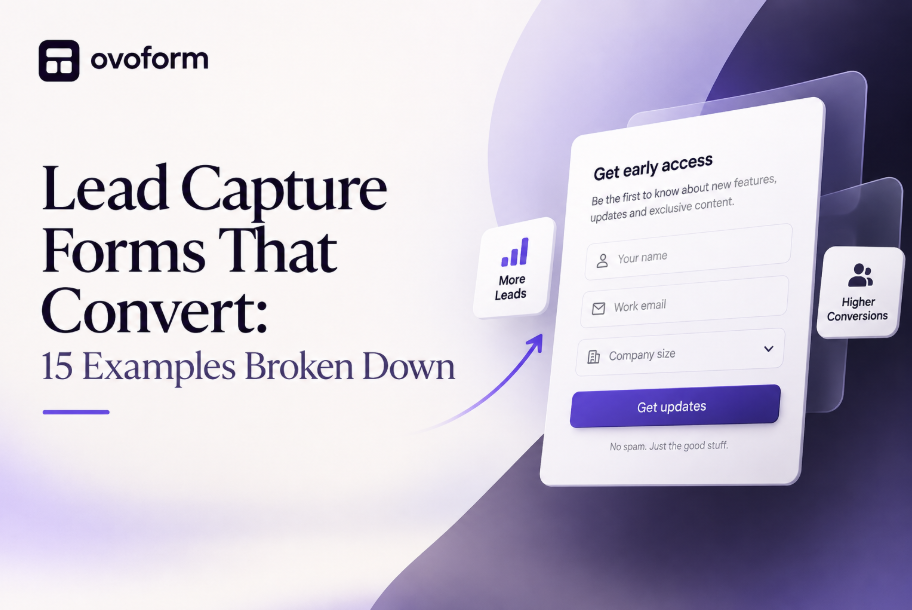
In this guide, we'll break down 15 lead capture form examples that convert, explain why they work, and share practical ideas you can adapt to your own business.
A lead capture form is an online form designed to collect information from potential customers in exchange for something valuable.
That "something" could be:
A free consultation
A downloadable guide
A product demo
A quote
A webinar registration
A free trial
Early access to a product
A newsletter subscription
Unlike a general contact form, a lead capture form has one clear objective: turning anonymous visitors into identifiable prospects.
The information you collect can then be used to continue the conversation through email, phone calls, or your sales process.
Many businesses assume that adding a form to a website is enough.
Unfortunately, that's rarely the case.
Small design decisions can have a surprisingly large impact on whether someone chooses to complete a form or leave your site.
Here are the most common reasons lead capture forms underperform.
Every additional field creates another decision for the visitor.
If someone has only just discovered your business, asking for extensive details can feel unnecessary or even intrusive.
Instead, collect only the information you genuinely need at that stage.
People rarely give away their contact details without a good reason.
Your form should answer one simple question:
"What do I get in return?"
Whether it's expert advice, a free resource, or a personalised quote, the value should be obvious before the visitor starts typing.
Buttons like "Submit" or "Send" don't tell users what happens next.
More specific alternatives often perform better, such as:
Get My Free Quote
Book My Demo
Download the Guide
Reserve My Spot
Start My Free Trial
More than half of website visitors now complete forms on mobile devices.
Tiny fields, awkward layouts, or buttons that are difficult to tap can quickly lead to abandoned forms.
Visitors are naturally cautious about sharing personal information.
Simple trust signals can help reduce hesitation, including:
Customer reviews
Security badges
Privacy statements
Client logos
Testimonials
Clear explanations of how information will be used
Although every business is different, high-converting forms tend to follow the same principles.
Your headline should explain the benefit immediately.
Instead of:
Contact Us
Try:
Get Your Free Marketing Audit
The second option gives visitors a clear reason to engage.
Ask yourself whether every question is necessary.
Do you really need:
Company size?
Phone number?
Postal address?
If not, remove them.
Shorter forms often outperform longer ones, especially for first-time visitors.
Not every visitor needs to answer the same questions.
Conditional logic allows your form to adapt based on previous responses.
For example:
A visitor selecting "Book a Product Demo" might be asked about company size.
Someone downloading an ebook may only need to provide their name and email address.
This keeps forms relevant and reduces unnecessary effort.
A well-designed form guides users naturally from one step to the next.
Effective forms use:
Plenty of spacing
Clear labels
Readable typography
Contrasting CTA buttons
Logical grouping of questions
Visitors should never feel overwhelmed.
Simple reassurance messages can significantly increase trust.
For example:
No spam, ever.
Your information stays private.
We respond within one business day.
No credit card required.
These small details reduce uncertainty at the point of conversion.
Rather than copying someone else's design, focus on understanding why each example works.
The principles behind these forms can be adapted to almost any industry.
Best for:
Consultants
Agencies
Accountants
Coaches
Lawyers
Why It Converts
Visitors requesting a consultation already have buying intent.
Instead of asking dozens of questions, this type of form keeps the process simple while gathering enough information to prepare for the conversation.
Recommended Fields
Name
Company
Brief challenge
Preferred meeting date
CTA
Book My Free Consultation
Common Mistake
Requesting detailed project specifications before the first conversation.
Pro Tip
Include available meeting times immediately after submission to reduce back-and-forth emails.
Best for:
SaaS
Marketing
Education
B2B businesses
Why It Converts
People love practical resources that solve a problem.
A high-quality ebook acts as a low-friction exchange: visitors receive valuable content, while your business gains a qualified lead.
Recommended Fields
First name
Email address
CTA
Download My Free Guide
Common Mistake
Adding unnecessary questions that delay access to the download.
Pro Tip
Deliver the resource instantly while following up with a helpful email sequence rather than an immediate sales pitch.
Best for:
SaaS companies
Software providers
B2B services
Why It Converts
Visitors requesting a demo are evaluating potential solutions and are often closer to making a purchasing decision.
A demo request form should collect enough context to personalise the conversation without creating unnecessary barriers.
Recommended Fields
Name
Work email
Company name
Team size
Primary use case
CTA
Schedule My Demo
Common Mistake
Asking for information that can easily be discussed during the demo itself.
Pro Tip
Use conditional logic to display industry-specific questions only when relevant, creating a shorter and more personalised experience.
Best for:
Coaches
B2B businesses
Training providers
Professional services
Why It Converts
Webinars offer immediate value through education, making them an effective way to attract leads who are genuinely interested in a topic.
Recommended Fields
Name
Job role
CTA
Reserve My Seat
Common Mistake
Requesting phone numbers or company addresses before registration.
Pro Tip
Send automated reminder emails before the event and a recording afterwards to continue nurturing attendees.
The best lead capture forms don't all look the same. They reflect the customer's intent, the business's goals, and the amount of information genuinely needed at that stage of the journey.
Here are 11 more examples that consistently perform well across different industries.
Best for:
Blogs
Publishers
SaaS companies
Ecommerce brands
Why It Converts
A newsletter is one of the lowest-commitment ways for visitors to stay connected with your business. Instead of selling immediately, you're inviting people to continue the conversation.
Recommended Fields
First name
Email address
CTA
Join the Newsletter
Common Mistake
Using generic copy like "Subscribe to our newsletter" without explaining what subscribers will actually receive.
Pro Tip
Tell visitors exactly what they'll get—for example, weekly industry insights, exclusive offers, or practical guides.
Best for:
Insurance
Construction
Home services
Manufacturing
Why It Converts
People requesting a quote are actively comparing options. They want a fast, accurate estimate without unnecessary hassle.
Recommended Fields
Name
Service required
Location
Short description
CTA
Get My Free Quote
Common Mistake
Asking for detailed specifications before providing an initial estimate.
Pro Tip
Use conditional logic to show different questions depending on the selected service.
Best for:
Conferences
Workshops
Community events
Networking sessions
Why It Converts
Visitors have already decided they're interested. The form should simply make registration quick and effortless.
Recommended Fields
Name
Organisation
Dietary requirements (if needed)
CTA
Reserve My Spot
Common Mistake
Collecting unnecessary marketing information during registration.
Pro Tip
Ask optional questions only after the essential registration details have been completed.
Best for:
SaaS
Apps
Digital platforms
Why It Converts
Visitors signing up for a free trial want immediate access. Every extra field increases the chance they'll abandon the process.
Recommended Fields
Name
Work email
Password
CTA
Start My Free Trial
Common Mistake
Requesting payment details before users have experienced the product.
Pro Tip
Delay collecting additional information until users have explored the platform.
Best for:
Clinics
Dentists
Physiotherapists
Private practices
Why It Converts
Patients appreciate forms that are simple, secure, and easy to complete.
Recommended Fields
Name
Contact number
Preferred appointment time
Reason for visit
CTA
Request an Appointment
Common Mistake
Displaying lengthy medical questionnaires before confirming an appointment.
Pro Tip
Use secure file uploads for referrals or previous medical records only when required.
Best for:
HR teams
Recruitment agencies
Growing businesses
Why It Converts
Candidates expect a professional and streamlined application process.
Recommended Fields
Name
CV upload
Portfolio (optional)
Cover message
CTA
Apply Now
Common Mistake
Requesting information that's already included in the uploaded CV.
Pro Tip
Use conditional logic to request a portfolio only for creative or technical roles.
Best for:
Startups
Product launches
Beta programmes
Why It Converts
Scarcity and exclusivity encourage sign-ups before a product is publicly available.
Recommended Fields
Name
CTA
Join the Waitlist
Common Mistake
Overcomplicating a form whose primary purpose is simply to gauge interest.
Pro Tip
Reward early sign-ups with exclusive updates or priority access.
Best for:
Agencies
Membership businesses
Subscription services
Why It Converts
Satisfied customers are often willing to recommend your business if the process is simple.
Recommended Fields
Referrer's name
Friend's email
Optional message
CTA
Send My Referral
Common Mistake
Making the referral process longer than necessary.
Pro Tip
Explain any referral reward clearly before visitors complete the form.
Best for:
Home improvement
Software
Professional services
Why It Converts
Visitors receive personalised information instead of generic pricing.
Recommended Fields
Service type
Project size
Budget range
CTA
Calculate My Estimate
Common Mistake
Providing unrealistic estimates without clear disclaimers.
Pro Tip
Display estimated pricing instantly while collecting contact details for a detailed follow-up.
Best for:
Ecommerce
Hospitality
SaaS
Why It Converts
Customers who have recently interacted with your business are more likely to respond while the experience is still fresh.
Recommended Fields
Rating
Comments
Email (optional)
CTA
Share My Feedback
Common Mistake
Asking dozens of survey questions after a simple purchase.
Pro Tip
Keep feedback forms under two minutes to complete.
Best for:
B2B sales
Agencies
Financial services
Why It Converts
Breaking longer forms into manageable steps reduces cognitive overload and makes the process feel shorter.
Recommended Fields
Step 1:
Name
Step 2:
Company size
Industry
Step 3:
Goals
Budget
CTA
Get My Personalised Plan
Common Mistake
Making every step mandatory without explaining why the information is needed.
Pro Tip
Include a progress bar so visitors know how much remains.
Although these examples serve different industries, the best-performing forms share several characteristics.
They:
Focus on one clear goal.
Ask only for essential information.
Explain the value visitors receive.
Use clear, action-oriented CTAs.
Work seamlessly on mobile devices.
Build trust with privacy assurances and social proof.
Use conditional logic to personalise questions.
Minimise distractions around the form.
Follow up quickly after submission.
These principles matter far more than visual style alone.
Different businesses need different approaches.
SaaS: Free trial or product demo forms.
Marketing agencies: Consultation or project enquiry forms.
Healthcare: Appointment requests with secure document uploads.
Education: Webinar registrations and course enquiries.
Ecommerce: Newsletter sign-ups and waitlists.
Professional services: Quote request forms.
Recruitment: Job application forms.
Events: Registration forms with automated confirmations.
If your forms involve different customer journeys, using conditional logic can keep each experience relevant without overwhelming visitors with unnecessary questions.
Generating more leads isn't always about increasing traffic.
Often, it's about removing the friction that stops interested visitors from taking the next step.
A thoughtfully designed lead capture form respects your visitors' time, communicates value clearly, and collects only the information needed to continue the conversation. Whether you're offering a free consultation, launching a new product, or booking appointments, small improvements to your forms can have a meaningful impact on conversion rates.
Rather than copying a single design, use these examples as inspiration. Test different headlines, calls to action, field lengths, and layouts to discover what resonates with your audience.
Create surveys, FAQs, and feedback forms in minutes with Ovoform — no code required.
Get started freeStart building with Ovoform today — free forever, no credit card required.
Get Started For Free