Surveys

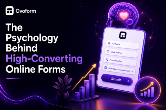
The psychology behind high-converting online forms is all about understanding how people think and make decisions. By keeping forms simple, building trust, using clear language, applying conditional logic, and creating a smooth mobile experience, businesses can reduce abandonment rates and encourage more users to complete their forms. Small improvements in design and user experience often lead to significant gains in conversions, proving that successful forms are as much about human behaviour as they are about technology.
Ovoform Team
August 17, 2026
Introduction
Have you ever started filling in an online form only to give up halfway through?
Maybe it looked too long. Maybe it asked for information that didn't feel necessary. Or perhaps something about the page just didn't feel trustworthy.
We've all been there.
Now think about the last form you completed without giving it a second thought. Chances are, it felt simple. The questions made sense. It didn't ask for too much too soon, and you always knew what to do next.
Here's the interesting part.
The difference wasn't luck, it was psychology.
Every online form influences the way people think and behave. From the colour of the submit button to the number of questions on the page, every small design choice affects whether someone completes the form or closes the tab.
The highest-converting forms aren't necessarily the shortest or the flashiest. They're the ones that understand how people make decisions.
In this guide, we'll explore the psychology behind high-converting online forms, why people abandon forms, and the simple design principles that encourage more visitors to hit Submit.
Most businesses see forms as a way to collect information.
Users see them differently.
To a visitor, every form asks a series of silent questions:
Can I trust this website?
How long will this take?
Why do they need this information?
Is it worth my time?
What happens after I submit it?
If the experience creates uncertainty around those questions, users may hesitate or leave.
Understanding these psychological and behavioural factors can help businesses remove unnecessary friction and create more intuitive form experiences.
A good form doesn't simply ask questions.
It guides the user's decision-making process.
People judge your form almost instantly.
If it looks cluttered, outdated, or confusing, they'll assume completing it will be difficult too.
A clean layout, clear spacing, and simple typography create an immediate sense of trust.
Example
Compare these two headlines:
❌ Complete Registration Form
✅ Let's Get Started
The second feels more conversational and focused on the user's next action.
The lesson isn't that one headline will automatically convert better.
It's that the language and presentation of a form can influence how approachable the experience feels.
When a form presents too many questions or decisions at once, the task can feel more demanding.
This is where cognitive load becomes important.
Imagine opening a form and immediately seeing 20 questions.
Even if each question is reasonable individually, seeing them all together can make the process feel like a lot of work.
Breaking complex information into smaller, logical sections can make the task easier to process.
This is one reason multi-step forms can be useful for longer applications.
People generally want to understand where they are in a process and what remains to be completed.
That's why progress indicators can be useful for longer forms.
For example:
Step 3 of 4
This gives users context and makes the remaining task easier to understand.
A progress indicator isn't a guaranteed conversion booster, however. Its effectiveness depends on the overall form experience.
If the form is confusing or unnecessarily long, a progress bar won't fix the underlying problem.
Sharing personal information always involves a small amount of risk.
Users may want reassurance before providing details such as their phone number, address, financial information, or other sensitive data.
You can strengthen trust by including:
Clear privacy messaging
Appropriate security information
Recognisable company branding
Professional design
Relevant testimonials or social proof
A clear explanation of why sensitive information is required
For example, instead of simply asking for a phone number, you could explain:
"We'll only use your phone number to contact you about your enquiry."
The goal is to answer the user's unspoken question:
"Why do you need this?"
The more uncertainty you remove, the easier it can be for users to make an informed decision.
Every unnecessary field creates another reason for someone to leave.
Before adding a question, ask:
"Do we genuinely need this information right now?"
If the answer is no, consider removing the field or collecting the information later.
However, shorter doesn't automatically mean better.
A form with fewer fields can still be frustrating if the questions are confusing or irrelevant.
The real objective is to minimise unnecessary effort
Nobody enjoys answering questions that don't apply to them.
Conditional logic allows forms to adapt based on previous answers.
For example:
Are you a business owner?
Yes → Show company-related questions.
No → Skip them.
Instead of presenting every visitor with the same questionnaire, the form can show only relevant sections.
This can make a complex process feel more personalised and reduce unnecessary questions.
It can also make the experience feel less like paperwork and more like a guided conversation.
Technical or unfamiliar language can make even a simple form feel intimidating.
Compare these labels:
❌ Applicant Identification
✅ Your Full Name
The second is immediately understandable.
Good form copy should tell users exactly what information you need without making them stop and interpret the question.
Clear language reduces uncertainty and helps users move through the form with confidence.
Good form design tells users where to look and what to do next.
Headings, spacing, grouping, field placement, button design, and visual contrast all contribute to that hierarchy.
For example, related questions can be grouped under headings such as:
Personal Information
Company Details
Project Requirements
Contact Preferences
When everything competes for attention, the form can feel overwhelming.
When the hierarchy is clear, users can understand the structure of the form more easily.
Good visual hierarchy doesn't just make a form look better.
It helps users navigate the experience.
People respond to feedback when completing interactive tasks.
Small messages such as:
Great choice!
Almost finished.
You're one step away.
can make an interaction feel more responsive and reassuring.
The key is moderation.
Feedback should help users understand what they've accomplished or what comes next rather than becoming distracting or overly promotional.
Even simple validation messages can make the experience feel more polished.
Users are accustomed to certain interface patterns.
They expect:
Labels near fields
Buttons in familiar locations
Standard input types
Clear navigation
Predictable next and back actions
Unusual interfaces aren't necessarily bad, but unnecessary novelty can make a form harder to understand.
Sometimes the most effective design isn't the most creative one.
It's the one that feels immediately familiar.
When users already understand how an interface works, they can spend less mental effort figuring out the interface itself.
Many people interact with online forms on smartphones.
Tiny text, difficult-to-tap buttons, excessive scrolling, and poorly designed fields can create unnecessary frustration.
A mobile-friendly form should consider:
Readable text
Large touch targets
Appropriate keyboard types
Clear field labels
Adequate spacing
Simple navigation
Fast loading
Accessible controls
The experience should feel easy to use regardless of screen size.
Mobile optimisation isn't simply a technical requirement.
It's part of the psychological experience of completing the form.
Submitting a form shouldn't feel like the end of the experience without explanation.
A clear confirmation reassures users that their information was successfully received and tells them what happens next.
Instead of:
Submission Successful
Try:
Thanks! We've received your enquiry and will be in touch shortly.
If appropriate, you can also provide:
Expected response time
Next steps
A link to useful resources
Contact information
A confirmation number
A clear ending helps remove uncertainty after submission.
Imagine a software company with a 12-field contact form.
The business could review whether every question is genuinely necessary at the initial stage.
If only five answers are required to qualify the enquiry, the form could start with those essential questions and collect additional information later.
The result may be a simpler experience with less perceived effort.
The important lesson is not "five fields always convert better than 12."
It's:
Only ask for information that serves a clear purpose.
Imagine an agency onboarding a new client.
The form needs to collect:
Contact information
Company details
Project goals
Budget
Timeline
Brand assets
Additional requirements
Putting everything on one page could make the process feel intimidating.
Instead, the agency could use a multi-step form:
Step 1: Contact information
Step 2: Company details
Step 3: Project requirements
Step 4: Budget and timeline
Step 5: Review and submit
Conditional logic could then show only the questions relevant to the services selected by the client.
The experience becomes more focused without necessarily reducing the amount of information collected.
Imagine an event registration form that asks every attendee:
"Do you have any dietary requirements?"
That question may not be necessary for everyone.
A better approach could be:
Will you attend the networking dinner?
Yes → Show dietary requirement options.
No → Skip the question.
This is a simple example of how conditional logic can remove irrelevant questions and make a form more efficient.
Several design decisions can create unnecessary friction.
Common problems include:
Asking for too much information too early
Using unclear field labels
Not explaining why sensitive information is required
Poor mobile optimisation
Making too many fields mandatory
Using progress indicators that don't accurately reflect the process
Weak or confusing calls to action
Cluttered layouts
Unnecessary distractions
Asking irrelevant questions
Providing poor error messages
Failing to explain what happens after submission
The common theme is simple:
Unnecessary effort and uncertainty can become barriers to completion.
Keep forms as short as possible.
Build trust with privacy and security messaging.
Use conditional logic to personalise questions.
Write clear, friendly labels.
Group related questions together.
Optimise every form for mobile devices.
Test different layouts and button text.
Make submission confirmations warm and reassuring.
High-converting online forms aren't built by chance, they're designed with people in mind.Every field, button, label, and interaction shapes how users experience the process.
When a form feels simple, trustworthy, relevant, and predictable, users have fewer reasons to hesitate.
Instead of focusing only on collecting more information, focus on removing friction.
Ask only what you need.
Explain why you're asking.
Use clear language.
Make the experience comfortable on mobile.
And guide users clearly from the first question to the final submission.
The psychology behind successful forms is ultimately about understanding the person on the other side of the screen.
Make people feel confident, respected, and in control.
That's the foundation of a better form experience.
Looking to create online forms that people actually enjoy completing?
With Ovoform, you can build intelligent forms using conditional logic, multi-step layouts, automation, and AI-powered features—all without writing code.
Create smoother experiences, collect cleaner data, and turn more visitors into completed submissions and qualified leads.
Create surveys, FAQs, and feedback forms in minutes with Ovoform — no code required.
Get started freeStart building with Ovoform today — free forever, no credit card required.
Get Started For Free