Surveys

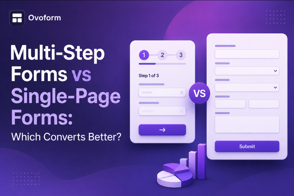
Choosing between a multi-step form and a single-page form isn't about following trends, it's about creating the smoothest experience for your audience. Single-page forms are ideal for quick actions like contact requests and newsletter signups, while multi-step forms excel when collecting detailed information for onboarding, healthcare, finance, recruitment, or complex enquiries. By keeping forms concise, using conditional logic, optimising for mobile, and reducing unnecessary friction, businesses can improve completion rates and generate more qualified leads. The best results come from matching your form design to your users' expectations rather than forcing every use case into the same layout.
Ovoform Team
August 15, 2026
Introduction
Imagine this.
You're signing up for a free consultation online. You click the button, expecting a quick process.
Instead, you're greeted with a form containing 25 fields staring back at you.
Name.
Email.
Phone.
Company.
Industry.
Budget.
Goals.
Timeline...
You haven't even started, yet you're already thinking about closing the tab.
Now imagine another experience.
You answer one simple question.
"What's your name?"
Click Next.
"What's your email?"
Next again.
Before you realize it, you've completed the entire form.
The number of questions didn't change.
The experience did.
That's why businesses often debate one important question:
Should you use a multi-step form or keep everything on one page?
The answer isn't as straightforward as many blog posts make it seem.
Some businesses see massive improvements with multi-step forms.
Others lose conversions because they split a form that never needed splitting.
In this guide, we'll compare both approaches, explain when each works best, share real-world examples, and help you choose the format that actually improves conversions.
A single-page form displays every field on one screen.
Users can scroll from top to bottom and submit everything at once.
Common examples
Newsletter signups
Basic enquiry forms
The biggest advantage?
Everything is visible immediately.
Users know exactly how much information they'll need to provide.
Instead of showing every field together, a multi-step form breaks questions into smaller sections.
For example:
Step 1 – Personal Details
↓
Step 2 – Business Information
↓
Step 3 – Requirements
↓
Step 4 – Review & Submit
Many modern form builders also include:
Progress bars
Conditional logic
Auto-save
Smart navigation
Mobile-friendly layouts
The experience feels more like having a conversation than filling out paperwork.
Every extra second someone spends wondering what to do next increases the chance they'll leave.
Your marketing campaign might be perfect.
Your landing page could be beautifully designed.
Your offer might be exactly what customers need.
But if the form feels overwhelming...
Everything before it becomes meaningless.
The form is the final step between interest and conversion.
Even small improvements can significantly increase completed submissions.
If you're only asking for:
Name
Phone Number
A single-page form is almost always the better choice.
Users can complete it within seconds.
There's no uncertainty.
People know exactly how many questions remain.
This transparency builds confidence.
Returning visitors often prefer quick forms without multiple screens.
They already understand the process.
Single-page forms require:
Less configuration
Fewer transitions
Minimal testing
Straightforward analytics
Problems usually appear when forms become too long.
Common issues include:
Information overload
Mobile scrolling fatigue
Higher abandonment
Lower completion rates
Harder navigation
Seeing twenty required fields instantly can discourage users before they even begin.
This is one of the biggest psychological advantages.
Even if both forms ask identical questions, breaking them into smaller steps reduces perceived effort.
Instead of seeing 25 questions...
Users only see one or two.
That feels manageable.
When forms require detailed information, multi-step layouts often outperform single-page designs.
Examples include:
Insurance applications
Patient intake
Mortgage enquiries
Client onboarding
Large forms become difficult to navigate on smartphones.
Multi-step forms keep each screen clean and focused.
Users don't need endless scrolling.
Modern forms can hide unnecessary questions.
For example:
Business Owner?
Yes →
Show company questions.
No →
Skip them entirely.
Users only answer relevant questions.
Seeing:
Step 3 of 4
feels much better than wondering how much longer the form continues.
Progress creates momentum.
They're not perfect.
Potential disadvantages include:
More setup time
Slightly longer loading if poorly optimised
Users may leave between steps
More testing required
If your form only asks four questions, splitting it into multiple pages often hurts rather than helps.
Here's the honest answer:
It depends on what you're asking.
Single-page forms usually perform better when:
Less than 7 fields
Simple enquiries
Newsletter subscriptions
Quick downloads
Contact requests
Multi-step forms usually perform better when:
More than 8–10 questions
Qualification processes
Client onboarding
Financial services
Real estate
Insurance
The goal isn't choosing the "better" form.
It's choosing the better experience.
Only two fields:
Name
A single-page form wins.
Anything more would add unnecessary friction.
An agency needs:
Contact information
Company details
Project goals
Budget
Timeline
Brand assets
Putting everything on one page would feel overwhelming.
Breaking it into four simple steps makes completion much more likely.
Patients may need to provide:
Insurance information
Emergency contacts
Current medications
Multi-step forms reduce stress while organising information logically.
Whether you choose single-page or multi-step forms, follow these proven practices.
Keep labels clear
Avoid confusing field names.
Use everyday language.
Ask only what you need
Every unnecessary field reduces conversions.
If you don't need it now...
Don't ask.
Optimise for mobile
Most users now complete forms on mobile devices.
Buttons should be easy to tap.
Fields should be large enough to fill comfortably.
Use conditional logic
Only show relevant questions.
Shorter forms convert better.
Include progress indicators
If using multi-step forms, show users exactly where they are.
Enable auto-save
Especially for long applications.
Users appreciate being able to continue later.
Reduce distractions
Remove unnecessary navigation links.
Keep attention focused on completing the form.
Businesses today don't just collect data.
They create personalised experiences.
Modern form builders allow you to:
Personalise questions
Skip irrelevant sections
Score leads automatically
Connect with CRMs
Trigger workflows instantly
Generate AI-powered summaries
The result?
Better user experiences and cleaner business data.
When evaluating a form builder, look for features like:
Multi-step forms
Conditional logic
AI assistance
Mobile responsiveness
CRM integrations
Secure data collection
Team collaboration
Custom branding
Workflow automation
Platforms like Ovoform make it easy to build both simple single-page forms and advanced multi-step workflows without writing code, allowing businesses to choose the format that best matches their users' needs.
There isn't a universal winner in the Multi-Step Forms vs Single-Page Forms debate.
The best-performing form is the one that respects your users' time and matches the complexity of the information you're collecting.
If your form is short, keep it simple. A clean single-page layout removes unnecessary clicks and helps users finish quickly.
If you're collecting detailed information, don't overwhelm visitors with a wall of fields. Breaking the process into clear, logical steps makes the experience feel lighter, more organised, and far less intimidating.
Instead of asking "Which form converts better?", ask "Which experience feels easier for my users?"
That small shift in thinking often leads to better conversions, happier users, and higher-quality data.
Create surveys, FAQs, and feedback forms in minutes with Ovoform — no code required.
Get started freeStart building with Ovoform today — free forever, no credit card required.
Get Started For Free