Surveys

Survey design isn't only about asking the right questions. The colors you choose influence trust, attention, readability, and completion rates. This guide explains how survey color psychology affects user behavior, when different colors work best, common mistakes to avoid, and practical design tips to help businesses create surveys that feel professional and encourage more meaningful responses.
Nikhil Dogra
September 2, 2026
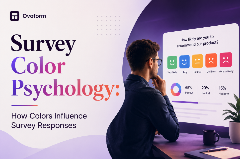
A well-written survey can still struggle to generate responses if the design doesn't inspire trust. One often-overlooked factor is color. The colors used in a survey influence how respondents perceive your brand, navigate questions, and decide whether to complete the form.
That's where survey color psychology comes in. It's not about influencing answers—it's about creating a clear, comfortable, and engaging experience that encourages participation. Whether you're collecting customer feedback, employee opinions, or market research, thoughtful color choices can improve usability and response rates.
In this guide, you'll learn how different survey colors affect user behavior, common mistakes to avoid, and practical tips for designing surveys that people are more likely to complete.
Color does more than support branding—it shapes how people interact with your surveys. Thoughtful color choices improve usability, build trust, and encourage more responses.
A well-designed survey attracts more participants and helps businesses collect accurate customer, employee, and market insights.
Clear colors and a clean layout make surveys easier to navigate, helping respondents stay focused and complete them.
Colors create a clear visual hierarchy by highlighting buttons, progress bars, and important messages, making the survey easier to use.
Higher completion rates lead to more reliable data, helping teams make better business and product decisions.
Quality feedback supports smarter decisions around products, pricing, and customer experience, contributing to long-term business growth.
Survey color psychology is the strategic use of colors to make surveys easier to read, navigate, and complete. Rather than influencing answers, it helps create a comfortable experience that encourages honest responses.
It's widely used in customer feedback, employee engagement, market research, healthcare, and education surveys.
Practical Example
Imagine two customer feedback surveys with the same questions. One uses bright, inconsistent colors, while the other uses a clean white background with blue action buttons and clear spacing. Most users will find the second survey easier to complete because its design reduces distractions and builds trust.
No single color works for every survey. The best choice depends on your audience, brand, and survey goals.
Blue creates a sense of trust and professionalism, making it ideal for customer feedback, B2B, and SaaS surveys. Use it for primary buttons and key actions to encourage confidence without adding pressure.
Green represents growth and completion. It's best used for progress bars, confirmation messages, and success indicators. Avoid overusing it, as too much green can reduce its impact.
Red naturally grabs attention, making it effective for error messages, warnings, and required fields. Use it sparingly to avoid making the survey feel stressful.
Yellow adds energy and works well for highlighting tips or important information. Use it in small accents, as large yellow backgrounds can reduce readability.
Orange encourages interaction and is commonly used for CTA buttons, event registrations, and sign-up forms. Pair it with neutral backgrounds for better visibility.
Purple conveys creativity and a premium feel, making it suitable for education, design, and innovation-focused surveys. It works best when it complements your brand identity.
Neutral colors create a clean and professional survey. White improves readability, gray reduces distractions, and black provides strong contrast for headings. Together, they help respondents focus on the questions rather than the design.
Different survey types require different color strategies to create the right experience.
Use blue and neutral colors to build trust and encourage honest feedback.
Soft blues, greens, and neutral tones create a comfortable environment where employees feel confident sharing their opinions.
Keep the design simple with one contrasting CTA button to attract attention without overwhelming users.
Use a clean, minimal color scheme so respondents stay focused on the questions instead of the design.
While color psychology can improve the survey experience, it should support usability rather than influence responses. The most effective surveys combine thoughtful color choices with clear questions, intuitive layouts, and consistent branding. Testing different color combinations with your audience helps identify what improves readability and completion rates without compromising accessibility.
A SaaS company collecting onboarding feedback might use blue to reinforce trust and green for progress indicators, creating a calm and structured experience. In contrast, an event registration survey could use orange for its call-to-action button to encourage sign-ups while keeping the rest of the design neutral and easy to navigate.
A good survey should be easy for everyone to read and complete, regardless of device or accessibility needs.
Choose dark text on light backgrounds to improve readability, especially on mobile devices.
Don't rely on color alone. Combine colors with icons or labels so important messages remain clear.
Test your survey on different screen sizes to ensure colors, spacing, and buttons remain easy to use.
Use colors that match your brand while keeping the survey clean and accessible.
Accessibility isn't only about supporting users with visual impairments. High contrast, readable fonts, and clear visual cues improve the experience for everyone, including users completing surveys on mobile devices or in different lighting conditions.
Too many bright colors can distract users and reduce completion rates. Stick to one primary color, one accent color, and neutral tones.
Use colors consistently. For example, reserve red for warnings and green for success messages to avoid confusing respondents.
Your survey should reflect your brand while maintaining readability and accessibility.
Make CTA buttons stand out with clear contrast so users can easily identify the next step.
Always test your survey across browsers and devices before sharing it to ensure a smooth user experience.
Minimal color palettes help respondents focus on answering questions rather than interpreting the interface.
Example: A customer satisfaction survey uses white backgrounds, dark text, and one blue action button throughout.
Trade-off: Simplicity improves usability but offers fewer opportunities for creative branding.
Use color to guide attention naturally.
Primary buttons should be more prominent than secondary actions, while headings should stand out without competing with calls to action.
A wellness survey, product feedback form, and event registration form don't need identical color schemes.
Choose colors that reinforce the purpose of the survey while remaining easy to read.
Small changes in button color, progress indicators, or background contrast can influence completion rates.
Instead of relying on assumptions, compare different versions with real users and measure performance.
Color is one element of survey optimization.
Track:
Completion rate
Drop-off points
Mobile completion
Average completion time
Button click-through rate
Combine these insights with qualitative feedback to refine future surveys.
Modern survey platforms make it easier to apply color psychology without requiring design expertise.
Instead of manually editing every element, businesses can customize themes, maintain consistent branding, and preview surveys across devices before publishing.
Platforms such as Ovoform allow teams to customize survey colors, apply branded themes, use conditional logic to personalize question flows, and optimize surveys for desktop and mobile users. The advantage is consistency across multiple surveys without rebuilding the design each time.
The trade-off is that advanced customization should still support usability. A visually impressive survey isn't effective if respondents struggle to complete it.
Before publishing your survey, make sure you:
✅ Use a consistent color palette.
✅ Maintain sufficient text contrast.
✅ Highlight primary actions with one accent color.
✅ Avoid relying only on color for important messages.
✅ Test surveys on desktop and mobile.
✅ Review accessibility for color-blind users.
✅ Keep branding consistent across surveys.
✅ Measure completion rates after launch.
✅ Test different button colors when appropriate.
✅ Update designs based on user feedback.
Survey color psychology helps create surveys that are easier to read, more engaging, and more likely to be completed. By choosing colors thoughtfully, maintaining accessibility, and keeping designs simple, businesses can improve the overall survey experience and collect more reliable feedback.
Whether you're creating customer feedback forms, employee surveys, or product research questionnaires, thoughtful color choices can make every interaction feel more intuitive. With customizable themes, conditional logic, and mobile-friendly survey design, Ovoform helps businesses build surveys that are both visually consistent and easy to complete.
Create surveys, FAQs, and feedback forms in minutes with Ovoform — no code required.
Get started freeStart building with Ovoform today — free forever, no credit card required.
Get Started For Free