Surveys

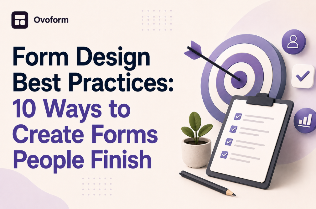
Effective form design can make the difference between a visitor completing an action and abandoning it. This guide explains 10 practical form design best practices for creating clearer, easier, and more trustworthy online forms. Learn how to reduce unnecessary fields, improve mobile usability, write better labels and CTAs, handle errors, build trust, and use analytics and user feedback to continuously improve form completion rates.
Ovoform team
August 13, 2026
You finally convince a visitor to click "Request a Demo," "Get Started," or "Contact Sales." They're interested in what you offer and ready to take the next step.Then they see your for. It asks for too much information, the layout feels overwhelming, and the purpose of some questions isn't clear. Within seconds, they close the page without submitting anything.
For many SaaS businesses, this is where valuable opportunities disappear.
While marketing teams often focus on increasing website traffic, improving SEO, or optimizing landing pages, the form itself is sometimes overlooked. Yet it's one of the most important conversion points in the customer journey. Even a well-designed landing page can't perform if the form introduces unnecessary friction.
Good form design isn't about making every form as short as possible. It's about making every interaction feel clear, intuitive, and worth completing. The best forms respect the user's time, ask only relevant questions, and guide people toward a successful submission without creating confusion.
In this guide, you'll learn practical form design best practices that help create high-converting forms, improve user experience, and support better conversion optimization across your website.
An online form is often the first meaningful interaction a potential customer has with your business. Whether someone is requesting a product demo, signing up for a free trial, downloading a resource, or contacting your sales team, the experience of completing that form shapes their perception of your brand.
Poorly designed forms create friction.
Well-designed forms build confidence.
That's why successful SaaS companies don't view forms as simple data collection tools—they see them as part of the product experience.
For example, imagine two project management platforms offering free trials.
The first asks visitors to complete 15 required fields before creating an account.
The second requests only a work email and password, then collects additional information during onboarding.
Both businesses receive the information they need, but the second removes unnecessary effort during the initial conversion. This approach often creates a smoother experience while allowing the business to build a richer customer profile later.
The goal isn't simply collecting more data.
It's collecting the right data at the right moment.
Before discussing individual design techniques, it's useful to understand the principles behind effective UX forms.
Successful forms typically share four characteristics:
They reduce unnecessary effort.
They communicate clearly.
They build trust before requesting information.
They help users recover from mistakes without frustration.
Rather than treating forms as static webpages, modern SaaS teams continuously test and refine them using customer feedback, analytics, and usability research.
One of the biggest reasons users abandon forms is being asked questions that don't seem relevant.
For example, if someone wants to download an ebook, asking for company revenue, annual budget, and team size may feel excessive.
Before adding a field, ask:
Does this information help us respond today?
Can we collect it later?
Will removing this field make the experience easier?
Progressive profiling can also help businesses collect essential information first and request additional details later.
Clearly distinguish required and optional fields. Users should be able to tell which information is necessary to continue and which details they can skip.
Best practice: Every field should have a clear purpose.
Businesses often organize forms around their internal workflow, but users care about completing their own task.
A customer requesting a product demonstration doesn't need to understand your internal sales process. They simply need a clear path to request the demo and provide the information necessary for the next step.
Organize questions in a natural order, such as:
Basic contact information
Purpose of the inquiry
Optional business details
Confirmation
Grouping related questions together reduces mental effort and creates a smoother flow from start to finish.
A form shouldn’t make users stop and wonder what they need to enter.
Use clear labels, helpful instructions, and concise supporting text.
Instead of:
Company
Use:
Company Name (Optional)
Instead of:
Phone Number
Use:
Phone Number — Used only to follow up on your request.
Small pieces of microcopy can reduce uncertainty without adding unnecessary clutter.
Avoid using placeholder text as a replacement for field labels. Placeholders can disappear when users start typing, making it harder to remember what information belongs in the field.
Why It Works
People are more likely to complete a form when they understand what information is required and how it will be used. Clear communication reduces mistakes, improves data quality, and creates a more confident user experience.
Expert Tip: Avoid relying only on placeholder text. Once users start typing, placeholders disappear, making it harder to review what each field is asking for. Always keep visible labels.
For many SaaS companies, a significant share of visitors come from mobile devices. Yet forms are often designed on large desktop screens and only tested on mobile later.
This can create several usability issues:
Small tap targets
Fields that are difficult to select
Buttons placed too close together
Excessive scrolling
Long dropdown menus
A mobile-friendly form should feel just as easy to complete on a phone as it does on a laptop.
Best Practices
Use large, easy-to-tap buttons.
Keep enough spacing between fields.
Use the correct keyboard type for email, phone number, and numeric fields.
Break long forms into manageable sections if necessary.
Test forms on multiple screen sizes before publishing.
Don't overlook accessibility. Use sufficient color contrast, clear labels, visible focus states, and form controls that can be navigated with a keyboard or assistive technology.
Errors are inevitable. The goal is to make them easy to understand and fix.
Avoid vague messages such as:
Invalid input
Something went wrong
Instead, explain what went wrong and what the user should do.
For example:
Password error
Better: Your password must contain at least eight characters, including one number.
Or:
Email invalid Better: Please enter a valid email address, such as name@example.com.
Clear error messages should explain what went wrong and how the user can fix it.
A common question in UX is whether multi-step forms convert better than single-page forms.
The answer depends on the context.
Single-Step Forms Work Best When:
Users need to provide only a few details.
The task can be completed in less than a minute.
You're collecting basic contact information.
Multi-Step Forms Work Best When:
The form contains many questions.
Information naturally falls into categories.
Users benefit from seeing progress as they move forward.
For example, a SaaS onboarding questionnaire might include:
Step 1: Account Details
Step 2: Company Information
Step 3: Goals and Preferences
This feels more manageable than presenting 20 fields on one screen.
The Trade-Off
Multi-step forms reduce visual complexity but introduce extra clicks. If each step feels meaningful and progress is visible, users are generally more willing to continue.
Before asking for information such as phone numbers, company size, budget, or other information that may feel sensitive or unnecessary
You can also reinforce trust with:
A brief privacy statement
Appropriate security information
Testimonials near high-intent forms
Clear expectations about what happens after submission
For example:
“We’ll respond within one business day. Your information won’t be shared with third parties.”
Clear expectations can make the submission process feel more transparent.
SaaS Perspective
Many SaaS businesses also delay asking for non-essential details until after users create an account. This approach, known as progressive profiling, keeps the initial signup experience simple while allowing additional information to be collected later.
Forms should be reviewed and improved over time.
Track metrics such as:
Form completion rate
Abandonment rate
Average completion time
Error frequency
Mobile completion rate
Conversion rate
Form completion rate and conversion rate aren't always the same metric. Completion rate measures how many users who started the form finished it, while conversion rate can refer to the percentage of visitors who completed the desired action. Define the metric you are measuring before evaluating form performance.
Then test individual changes, such as:
Shorter forms
Different button text
Field order
Multi-step versus single-step layouts
Optional versus required fields
Focus on changes supported by actual user behavior rather than assumptions.
A well-designed form can still underperform if the call-to-action (CTA) doesn't set the right expectation.
Generic button labels like "Submit" or "Send" don't tell users what will happen next. Instead, use action-oriented text that reflects the outcome users are expecting.
For example:
Instead of | Try |
Submit | Get My Free Trial |
Send | Request a Demo |
Continue | Create My Account |
Register | Join the Webinar |
The CTA should reduce uncertainty by answering the user's silent question: "What happens after I click this button?"
SaaS Perspective
For a free trial form, "Start Free Trial" is much clearer than "Submit." For a consultation form, "Book My Consultation" creates stronger intent because it reinforces the value users will receive.
Even if your analytics show strong conversion rates, there is always room for improvement.
Collect qualitative feedback alongside quantitative metrics.
Ask questions like:
Was anything confusing?
Did you hesitate before submitting?
Which question felt unnecessary?
Was the form easy to complete on mobile?
Combining analytics with real user feedback helps identify problems that numbers alone cannot explain.
The highest-performing SaaS companies treat form optimization as an ongoing process rather than a one-time project.
Even experienced designers can introduce friction without realizing it. Watch out for these common mistakes:
Long forms often discourage users before they even begin.
Only mark essential fields as mandatory. Optional fields give users more flexibility.
A form that works well on desktop but is difficult to complete on a smartphone can significantly reduce conversions.
Users shouldn't need to understand your company's internal terminology. Keep labels simple and customer-focused.
After submission, users should know exactly what to expect. A clear confirmation message or thank-you page builds confidence and reduces uncertainty.
Before publishing your next form, review this checklist:
✅ Ask only for essential information.
✅ Group related fields together.
✅ Write clear labels and helpful microcopy.
✅ Optimize for mobile devices.
✅ Use descriptive CTA buttons.
✅ Display helpful validation messages.
✅ Build trust with privacy messaging.
✅ Test one improvement at a time.
✅ Measure completion and abandonment rates.
✅ Regularly gather user feedback.
Small improvements across these areas can collectively create a much smoother experience and increase the likelihood that users complete your forms.
Great forms don't happen by accident. They're the result of understanding user behavior, reducing friction, and continuously refining the experience.
The most successful SaaS businesses don't see forms as simple data collection tools. Instead, they treat them as an important part of the customer journey. Every field, label, and button contributes to how users perceive the product and whether they choose to continue.
By applying these form design best practices, you can create high-converting forms that feel effortless to complete while helping your business collect meaningful information at the right stage of the customer relationship.
Remember, the objective isn't to gather as much data as possible. It's to create an experience that users trust enough to finish.
Create surveys, FAQs, and feedback forms in minutes with Ovoform — no code required.
Get started freeStart building with Ovoform today — free forever, no credit card required.
Get Started For Free