Surveys

Learn how to create effective multi-step forms that make long forms easier to complete and less overwhelming. This guide covers form structure, conditional logic, progress indicators, mobile optimization, workflow automation, and best practices to improve user experience, data quality, and completion rates.
Nikhil Dogra
August 23, 2026
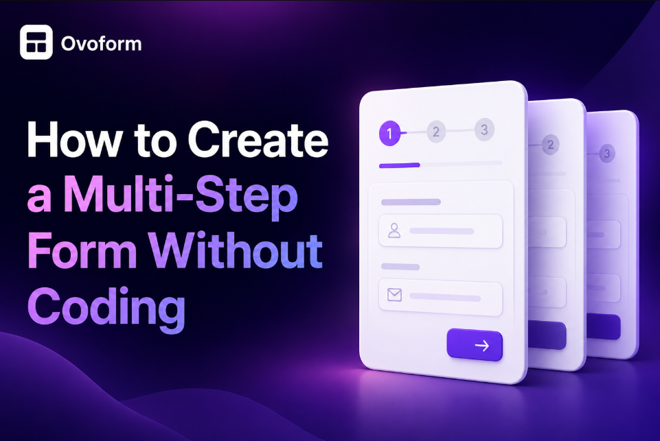
A long form can feel overwhelming before a visitor even answers the first question. Whether someone is signing up for a free trial, requesting a demo, booking a consultation, or completing a customer intake form, seeing dozens of fields on one page often leads to hesitation and sometimes abandonment.
Breaking a form into smaller, logical steps creates a smoother experience. Instead of asking for everything at once, you guide users through one section at a time, making the process feel shorter and easier to complete.
The good news is that you don't need development skills to create a multi-step form. Modern no-code form builders allow businesses to design multi-page forms, add conditional logic, connect workflows, and collect high-quality data using visual editors.
In this guide, you'll learn when multi-step forms make sense, how to structure them effectively, common mistakes to avoid, and practical techniques to improve both user experience and conversion rates.
Every form is part of a customer journey. Someone filling out a demo request, support ticket, healthcare intake, or onboarding questionnaire is trying to accomplish a task quickly.
When a form feels confusing or unnecessarily long, users lose momentum. Some skip questions, provide inaccurate information, or leave without submitting the form altogether.
Multi-step forms reduce that friction by presenting information in smaller sections. Instead of one intimidating page, users focus on one task at a time.
For businesses, this creates measurable benefits:
Higher completion rates
Better-quality customer data
Improved lead qualification
Reduced form abandonment
Easier mobile experiences
More efficient workflow automation
For SaaS companies, multi-step forms also support different stages of the customer lifecycle. Marketing teams can capture leads, sales teams can qualify prospects, and customer success teams can collect onboarding information—all while keeping the experience simple for the user.
A multi-step form divides a long form into smaller pages or sections. Instead of displaying every question at once, it guides users through a sequence of logical steps.
For example, a demo request might follow this structure:
Step | Information Collected |
Step 1 | Name and email |
Step 2 | Company details |
Step 3 | Business goals |
Step 4 | Preferred meeting time |
Step 5 | Review and submit |
Each step focuses on one objective, helping users complete the form with less cognitive effort.
People make decisions one step at a time. Breaking a large task into smaller actions makes progress feel faster, even when the total number of questions remains the same.
Businesses collect more complete and accurate information while reducing incomplete submissions.
Visitors feel less overwhelmed, especially on mobile devices where scrolling through long forms can be frustrating.
A project management platform uses a multi-step onboarding form. New customers first enter basic account details, then select team size, preferred integrations, and business goals before creating their workspace.
This approach keeps onboarding organized while collecting everything needed to personalize the customer's experience.
Group related questions together instead of randomly splitting them across pages.
Very short forms don't benefit from multiple steps. If your form contains only three or four fields, adding additional pages can introduce unnecessary clicks.
Use multi-step forms only when they simplify the experience. If navigation becomes more complicated than the original form, a single-page layout may perform better.
Not every form should be divided into multiple pages.
A contact form asking for a name, email, and message works perfectly as a single-page form. On the other hand, a customer onboarding questionnaire or healthcare intake form usually benefits from multiple sections.
Free trial signups
Customer onboarding
Demo request forms
Loan applications
Healthcare intake
Agency client intake
Booking workflows
Choosing the right structure improves usability without adding unnecessary complexity.
Users complete forms more often when the number of questions matches the format.
Visitors experience a process that feels appropriate for the task rather than unnecessarily long.
A CRM platform asks only for basic account information during registration. Additional setup questions appear later during onboarding, reducing friction while still collecting valuable data.
Estimate how long the form will take to complete. If users need more than a minute or two, consider breaking it into multiple steps.
Multi-step forms require more planning than single-page forms. Each step should have a clear purpose.
Don't create multiple steps just because your form builder supports them. Use them only when they improve clarity and reduce cognitive load.
The best multi-step forms are designed around the user's thought process—not your database.
Before creating the form, map the information you need and organize it into logical groups.
A common structure looks like this:
Step | Purpose |
Introduction | Set expectations |
Personal Details | Collect contact information |
Business Information | Understand context |
Qualification Questions | Gather relevant details |
Review | Confirm responses |
Submission | Complete the process |
A logical flow keeps users engaged because each step naturally leads to the next.
Better organization improves data quality and simplifies workflow automation.
Users spend less time wondering what information comes next.
A software company's onboarding form first asks about the user's company, then team size, then product goals. This sequence mirrors how customers naturally think about implementation.
Place easy questions first to build momentum before asking for more detailed information.
Moving qualification questions too early may discourage users who haven't yet invested in completing the form.
Start with low-effort questions, then gradually request more detailed information as users progress through the form.
Modern no-code platforms make it possible to build professional multi-page forms without writing HTML, CSS, or JavaScript.
When evaluating an online form builder, look for features such as:
Multi-page layouts
Conditional logic
Drag-and-drop editing
Mobile responsiveness
Workflow automation
Custom branding
Progress indicators
The right platform should support both user experience and business operations.
No-code tools reduce development time while allowing marketing and operations teams to update forms independently.
Visitors benefit from consistent, intuitive experiences across devices.
A growing SaaS business uses a no-code form builder to launch a new onboarding workflow in a single afternoon, allowing the marketing team to iterate without waiting for engineering resources.
Prioritize usability and workflow capabilities over long feature lists.
Some advanced enterprise requirements may still require API integrations or custom development.
Choose a platform that can scale with your business. Rebuilding forms later because you've outgrown your software is often more costly than selecting a flexible solution from the start.
Every page in a multi-step form should have a single purpose. Mixing unrelated questions forces users to switch context, increasing the mental effort needed to complete the form.
For example, instead of placing personal details, billing information, and project requirements on the same page, separate them into logical sections.
Grouping related questions creates a smoother experience and helps users understand why you're asking for specific information.
Better organization improves data quality and makes it easier to route information into your CRM or workflow automation tools.
Visitors complete forms with greater confidence because every step feels manageable.
A customer onboarding form collects account information first, workspace preferences second, and integration requirements last. This mirrors the onboarding journey and keeps users focused.
Limit each step to one topic and avoid adding more than five or six fields unless absolutely necessary.
Splitting forms into too many pages can make progress feel slow. If each page contains only one simple field, users may become frustrated by excessive clicking.
If you can't describe a page with a single heading, it probably contains too many unrelated questions.
Conditional logic displays questions based on previous answers. Instead of asking every visitor the same questions, the form adapts as they progress.
For example:
A freelancer skips enterprise-related questions.
An enterprise customer sees additional onboarding questions.
Existing customers see support options instead of sales questions.
People only answer questions that are relevant to their situation, reducing unnecessary effort.
Sales and customer success teams receive more meaningful information while avoiding incomplete or irrelevant responses.
Visitors spend less time completing forms and enjoy a more personalized experience.
A software company asks users whether they're starting a free trial or requesting a demo. Each option opens a different set of questions, helping the sales team qualify leads more effectively.
Plan conditional paths before building the form. Keeping the logic simple makes future updates easier.
Complex conditional flows require careful testing to ensure users never encounter broken or confusing paths.
Use conditional logic to simplify the experience—not to hide important information users still need to provide.
Users like knowing how much work remains. A progress bar or step indicator provides reassurance and encourages them to continue.
Validation also improves the experience by catching mistakes immediately instead of after submission.
Examples include:
Required field checks
Email format validation
Phone number formatting
Date selection validation
Clear feedback reduces confusion and minimizes submission errors.
Accurate data reduces manual corrections and improves reporting.
Visitors complete forms faster without repeatedly correcting mistakes.
An event registration form highlights missing required fields before users move to the next step, reducing failed submissions.
Display helpful validation messages that explain how to fix errors instead of generic alerts.
Too many validation rules can feel restrictive. Validate only information that's essential for accurate processing.
Use friendly language like "Please enter a valid business email" rather than technical error messages.
A multi-step form becomes significantly more valuable when it feeds directly into your business systems.
Consider connecting your form to:
CRM software
Email marketing platforms
Project management tools
Customer support systems
Calendar applications
Internal notification tools
Automation reduces manual work and ensures information reaches the right team quickly.
Collecting information is only the beginning. Acting on that information efficiently creates business value.
Teams spend less time transferring data and more time engaging customers.
Leads receive faster follow-ups, onboarding begins sooner, and support requests reach the right people without delays.
A demo request form automatically creates a CRM contact, assigns the lead based on region, sends a confirmation email, and notifies the sales representative.
Map every form field carefully before publishing workflows to avoid incomplete customer records.
As workflows become more sophisticated, they require regular monitoring and maintenance.
Automate repetitive tasks first. Once those workflows are reliable, expand automation gradually.
Mistake | Consequence | How to Fix It |
Splitting short forms into multiple pages | Extra clicks reduce usability | Use a single-page form for simple requests. |
Asking too many questions | Higher abandonment rates | Collect only the information needed for the next step. |
Poor step organization | Users become confused | Group related questions together. |
Ignoring mobile users | Lower completion rates | Test every form on multiple screen sizes. |
Skipping workflow testing | Incorrect CRM records or notifications | Test every submission before publishing. |
Start with basic questions to build momentum before requesting detailed information.
Ensure buttons, inputs, and navigation are easy to use on smaller screens.
Each step should explain what users are about to complete.
For longer forms, allowing users to continue later can reduce abandonment.
Monitor completion rates, drop-off points, and submission quality to identify opportunities for improvement.
Don't assume your first version is your best version. Small improvements to wording, page order, or validation often lead to meaningful gains in completion rates.
Before publishing your multi-step form:
Define the form's primary goal.
Organize questions into logical sections.
Keep each page focused on one topic.
Use conditional logic where appropriate.
Add progress indicators.
Validate important fields.
Optimize for mobile devices.
Connect workflows to your CRM or business tools.
Test every path before publishing.
Monitor analytics and improve regularly.
A well-designed multi-step form does more than make long forms look better. It guides users through a logical journey, reduces friction, improves data quality, and creates a stronger customer experience.
Success depends on thoughtful planning rather than simply splitting a form into multiple pages. Organize questions around the user's journey, use conditional logic carefully, validate information as it's entered, and connect submissions to the workflows your business already relies on.
Once your form is live, continue monitoring analytics, testing improvements, and refining the experience based on real user behavior. Small changes often have a measurable impact on completion rates and lead quality.
If you're evaluating a no-code form platform, choose one that combines flexible multi-step forms, workflow automation, analytics, and seamless integrations. A solution like Ovoform can help you create user-friendly forms that support both your customers and your internal teams without requiring custom development.
Create surveys, FAQs, and feedback forms in minutes with Ovoform — no code required.
Get started freeStart building with Ovoform today — free forever, no credit card required.
Get Started For Free